THE BIG ISSUE MAGAZINE COVERS
The Big issue magazine covers
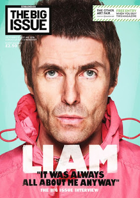
Liam Gallagher
The main image is of an iconic British artist mostly recognised from the famous British band called Oasis.
The colour theme presented here is interesting. It cleverly encapsulates the artists features. For example the main, background colour is a light blue/turquoise shade which is a similar colour to the artists eyes. Also there are other features that match the colour scheme for example Liam's outfit featuring a bright pink raincoat jacket is a similar shade to the shade of his lips and tear ducks. The traditional colours seen in magazines, white and black are also featured in the mast head as well as the artist's name and speech text. This adds a simplistic elegance to the magazine because although the other colours featured are bright and fit with a summer season colour scheme, which indicates when the magazine was published. Also to fit the summery theme the artist appears to have a tanned completion which may have been achieved with bright use of lighting, editing or makeup.
This means that the final finish isn't over complicated with extra colours that aren't already in the main image or in the style of the masthead. Also, the white colour highlights the whites of the artists eyes. on the right side of the masthead the black border blends into the artists hair which increases the fluidity of the page as it looks as if it is blended together slightly.
The image of the star's face and neck is centred, which makes his face appear as more symmetrical and perhaps attractive. It is also slightly crops the top of the artists head.
The trademark font for the masthead is traditional to the big issue. The black and white colours are bold and conventional to magazines as previously mentioned. It is presented in a text box and is not the biggest text presented on the page.
The text 'Liam' has a tone of transparency which is strongly contrasted against the bold black font as well as the brightness of the pin k tones from the clothing. The actual magazine layout can be viewed as unconventional as it doesn't have a traditional text layout. for example, usually in magazines the text on the front cover it presented as in columns wither to the left or right side of the page or both. Also the model/ celebrity featured has a less of a close-up angled shot, in fashion magazines to model clothing, in music magazines to show off instruments. yet here it is different as it just features his face, and limited text.
style of the magazine
another traditional convection of magazines is a barcode. However it is not featured here. This represents the way in which the magazine is sold. On the streets by the homeless instead of in store retailers.
price: cheaper than most magazines, profit goes to the homeless retailers
political issues
Mothers day issue
Here the main image is unconventional. its an art instillation rather than an actual picturised image, in the design of Roy Lichtenstein's famous dot work for a mothers day edition of the big issue. The text cleverly advertises for the Big issue shop franchise in the speech bubble which is a symbol within the Lichtenstein style, which contributes to the design of the magazine overall.
The color themes
the price is consistently the same throughout all examples of the magazines, which is again fairly low. Also there is no barcode again. featured again is the brand masthead with a boldline border and bold text.
masthead
Morrissey
'brexiteer' political issues
text around image
looks like its been drawn
firey colour scheme
black and white image
illustration on the left


Comments
Post a Comment